MASTERPLUG BRAND GUIDELINES
Masterplug offers portable power solutions. Although its brand works, it needed guidelines for consistency.

The brand has a distinguished look that makes it stand out from the competition, but design work was largely inconsistent, with no regard for scale or balance between the design elements. The artwork looked similar, but when the products were side by side it was clear how inconsistent the brand was, and it weakened visual impact.
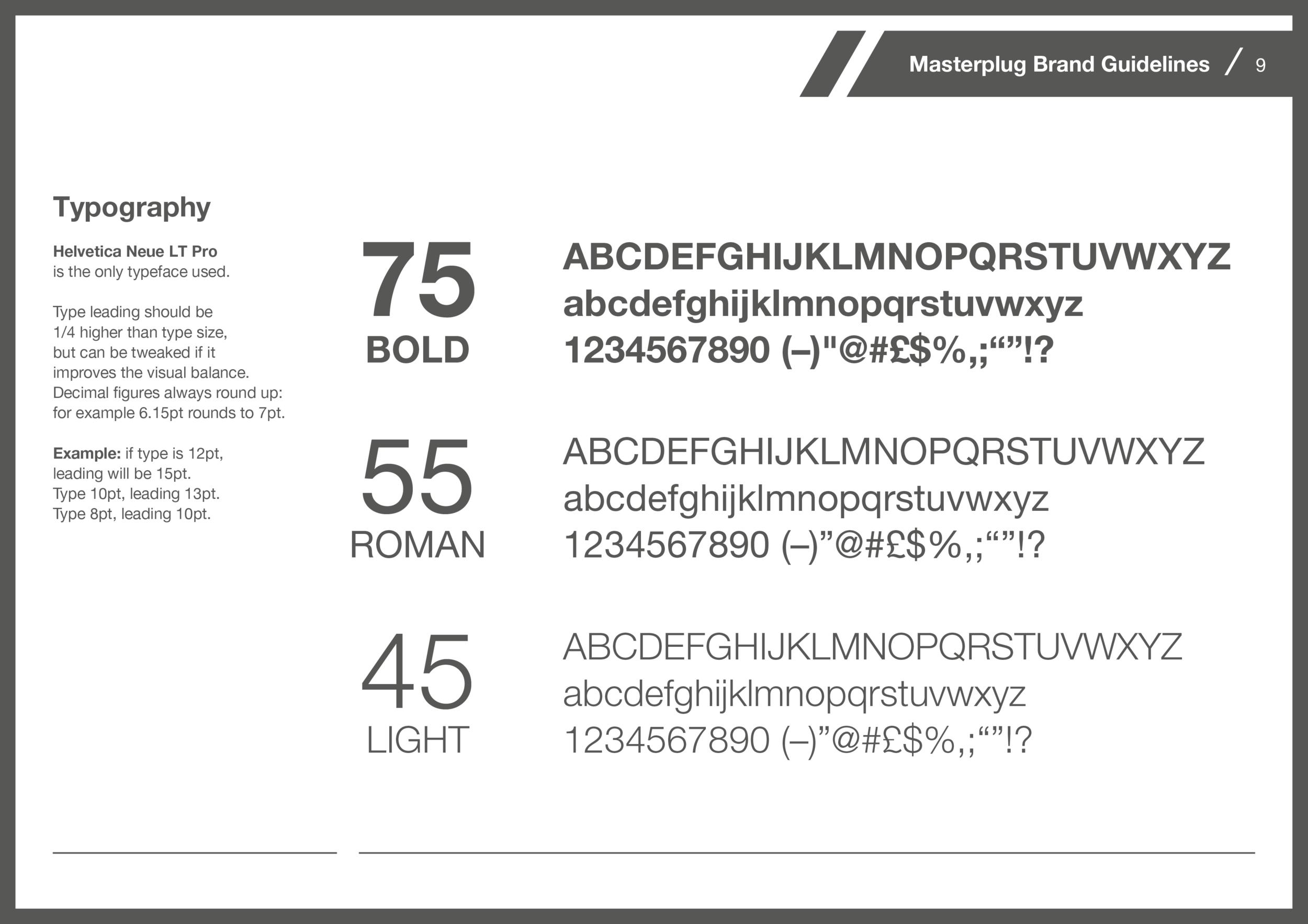
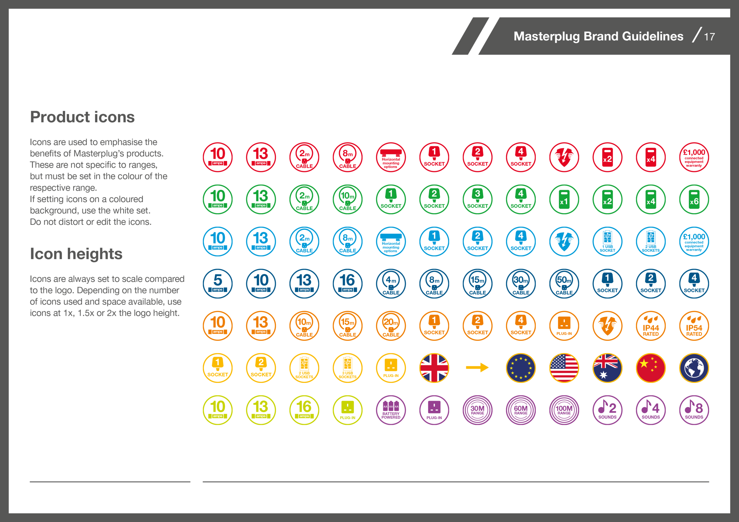
Typefaces were all over the place, with 4 different fonts being used on similar products, across various weights. Colours were inconsistent throughout, with different designers using different references. This wall all reduced to one typeface, using three weights, and to a well-defined set of colour swatches.


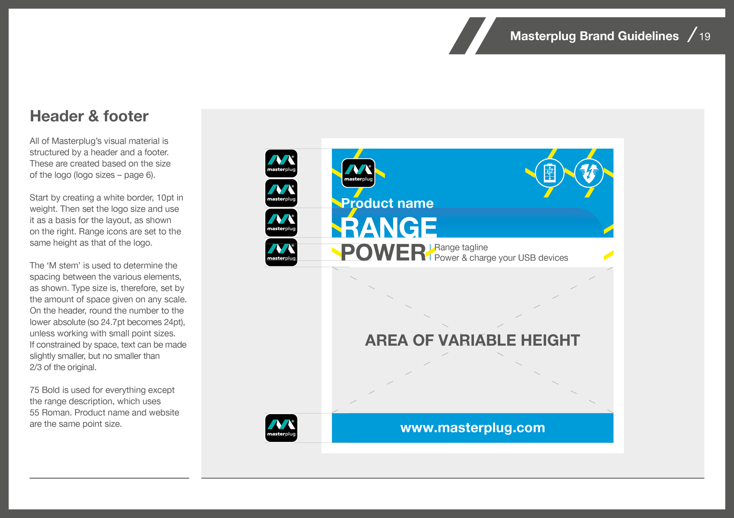
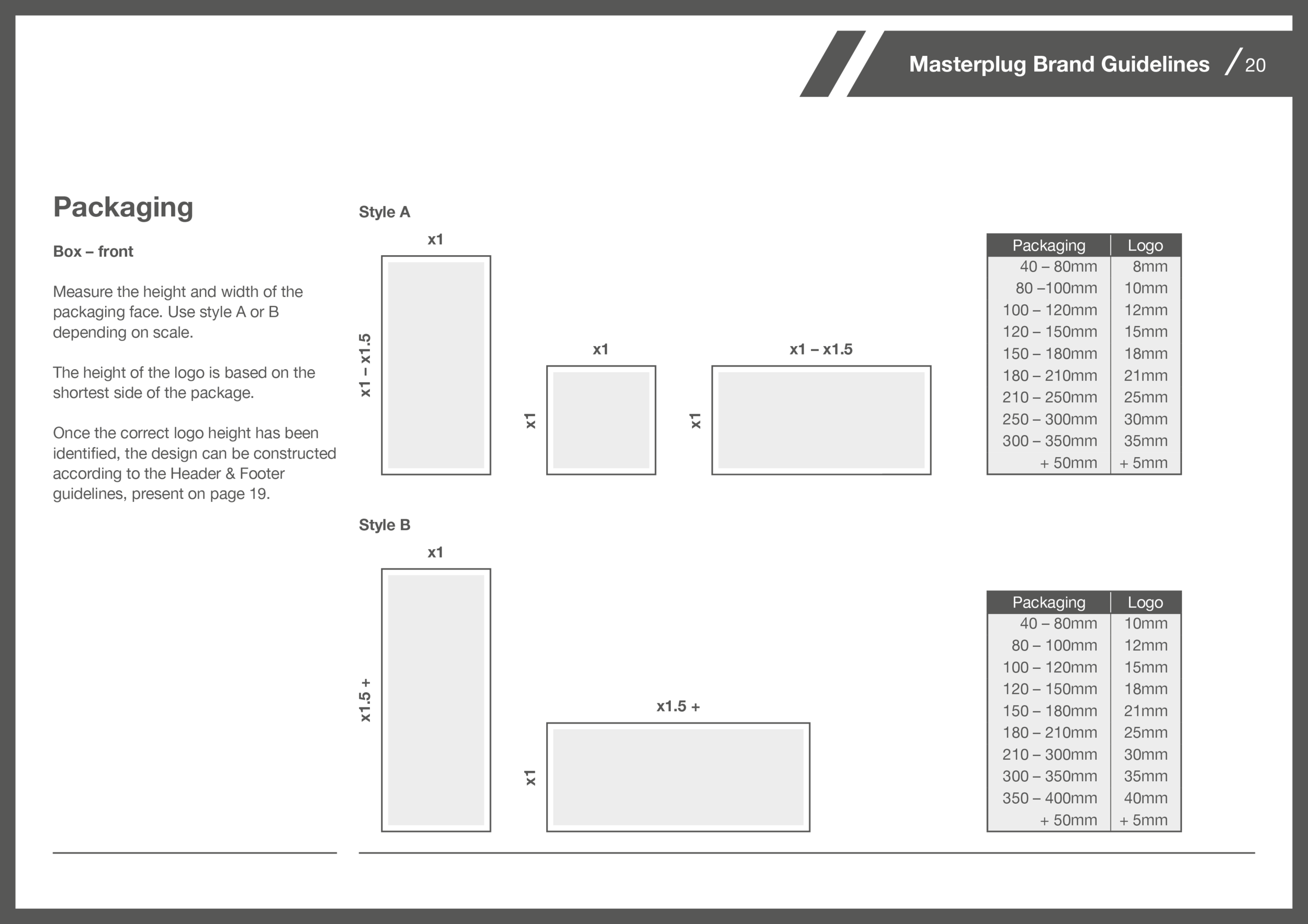
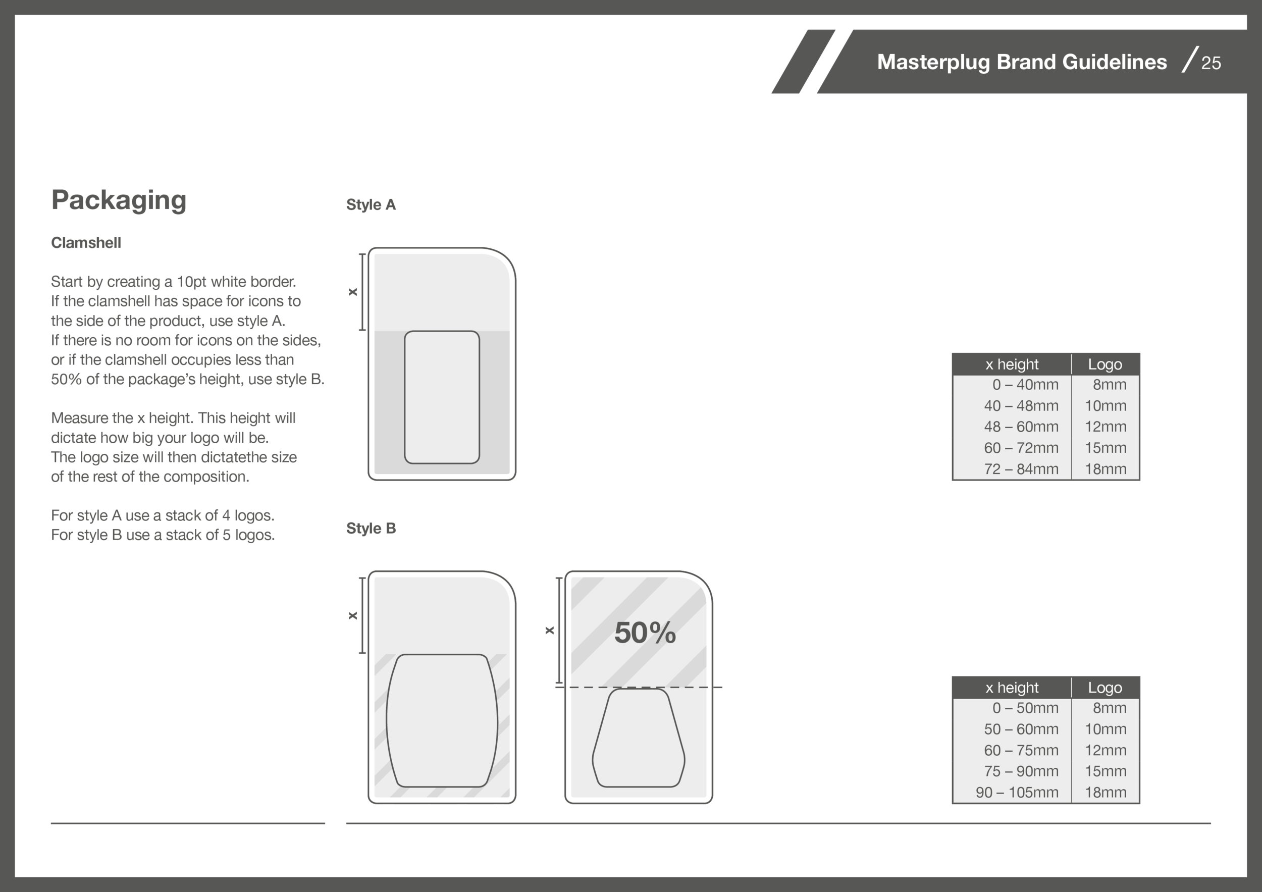
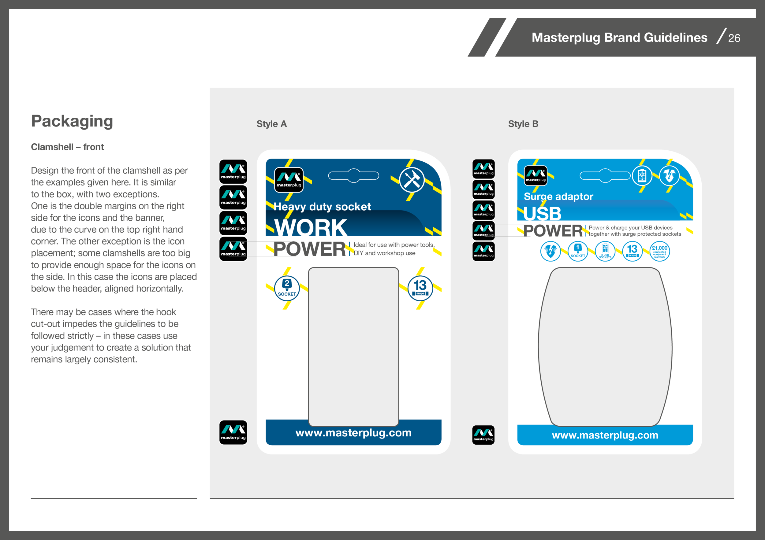
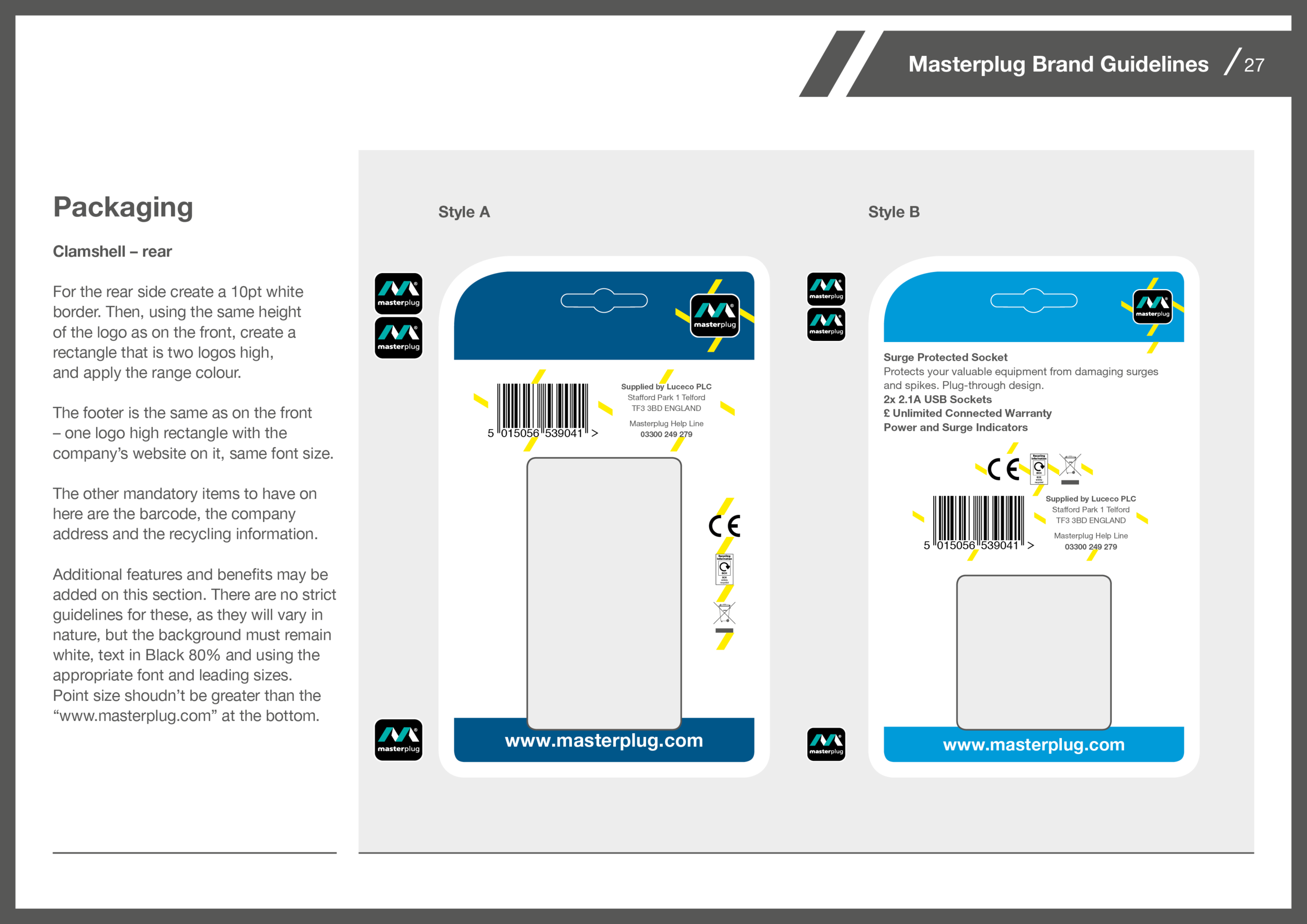
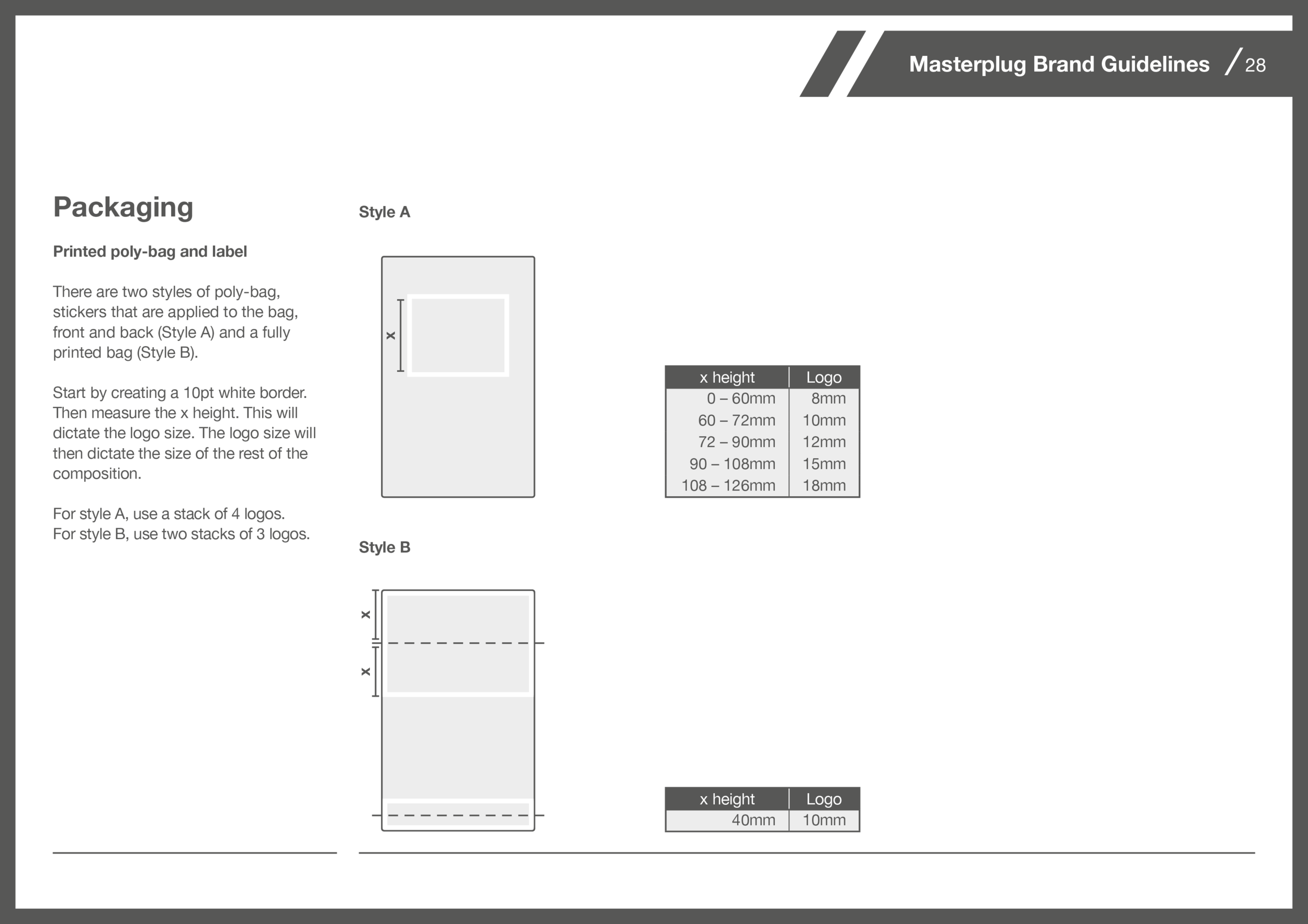
The solution was to create a design that is scalable, with pre-defined heights to work from. The size of the packaging dictates the size of the logo, and the size of the logo dictates the size of every other element. This way all elements remain consistent throughout, on a simple set of guidelines that is easy to use.
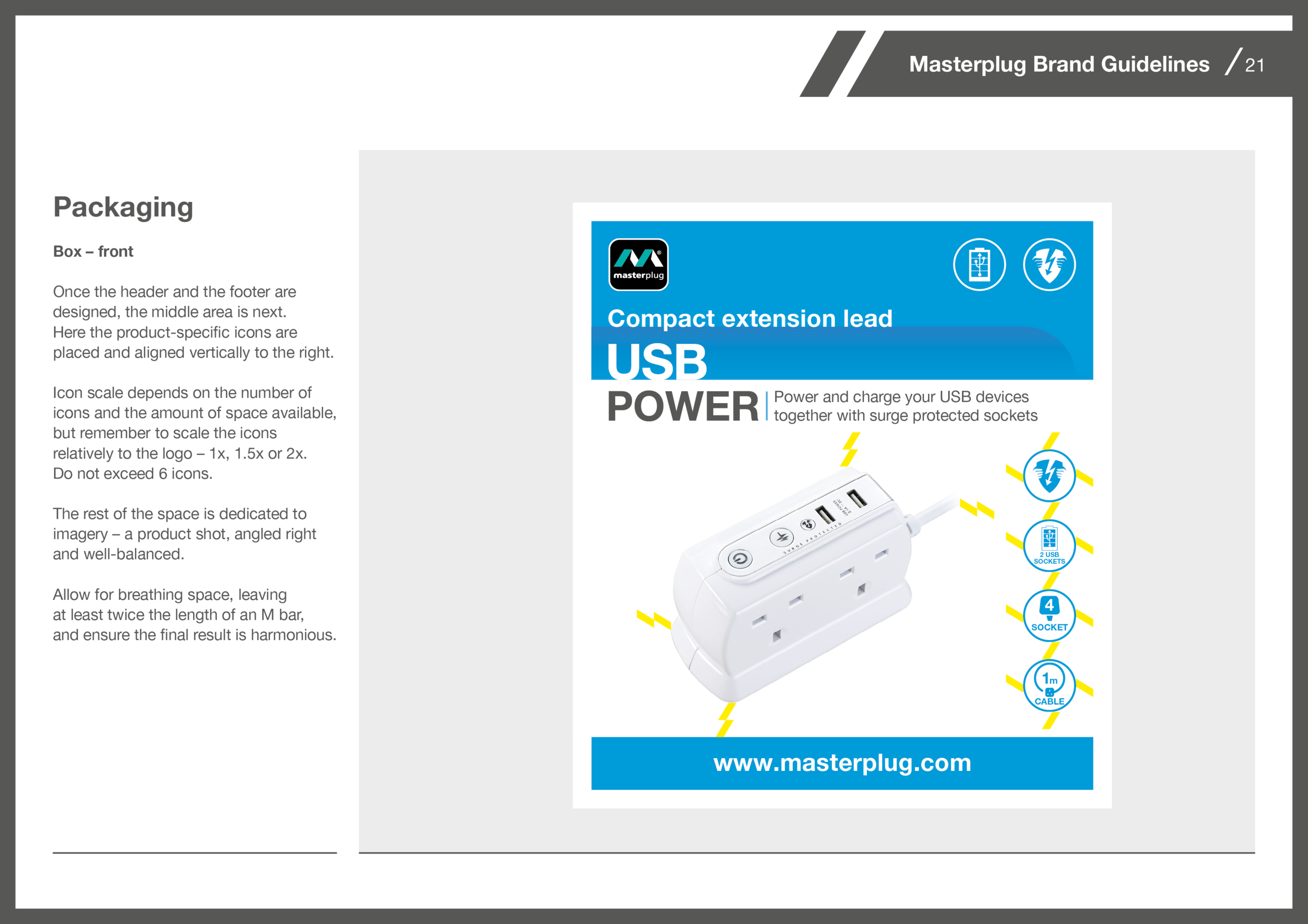
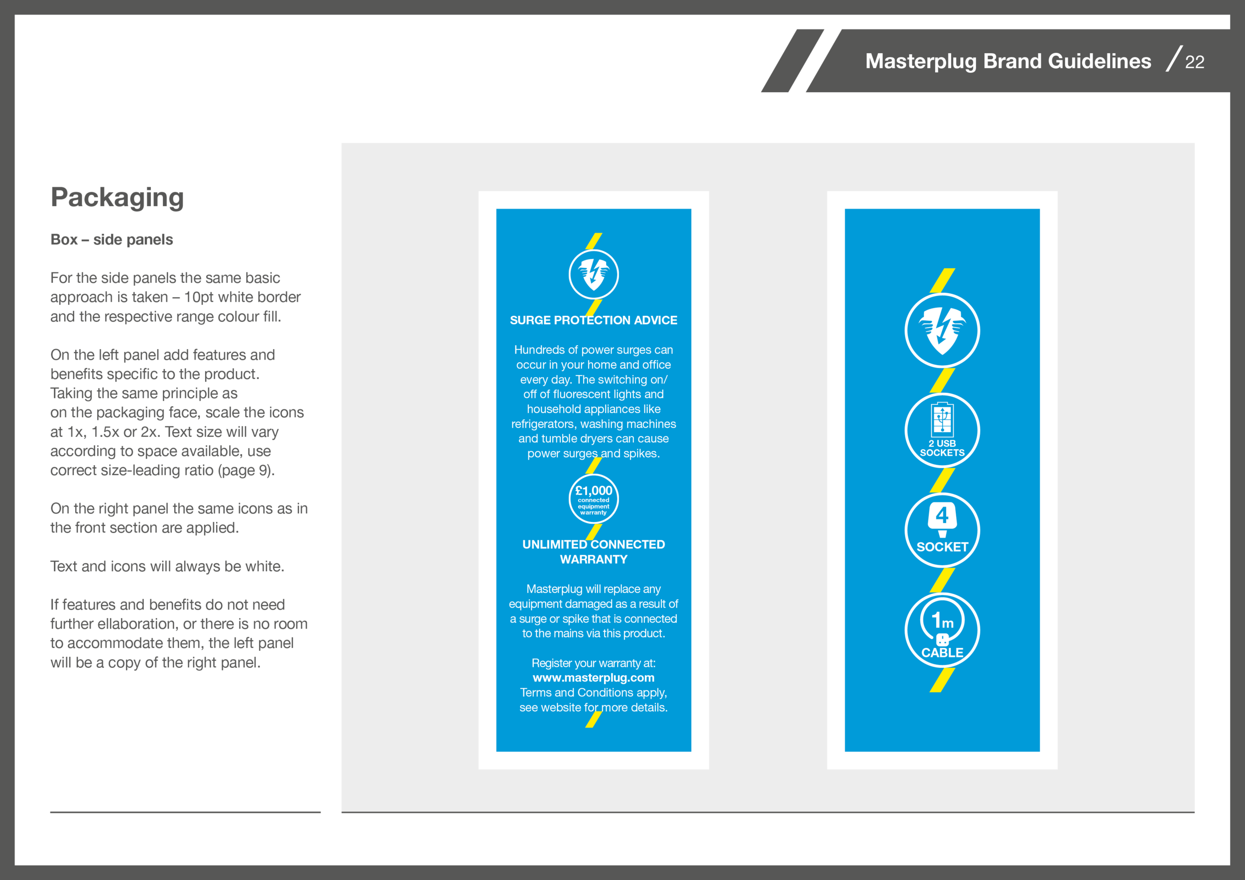
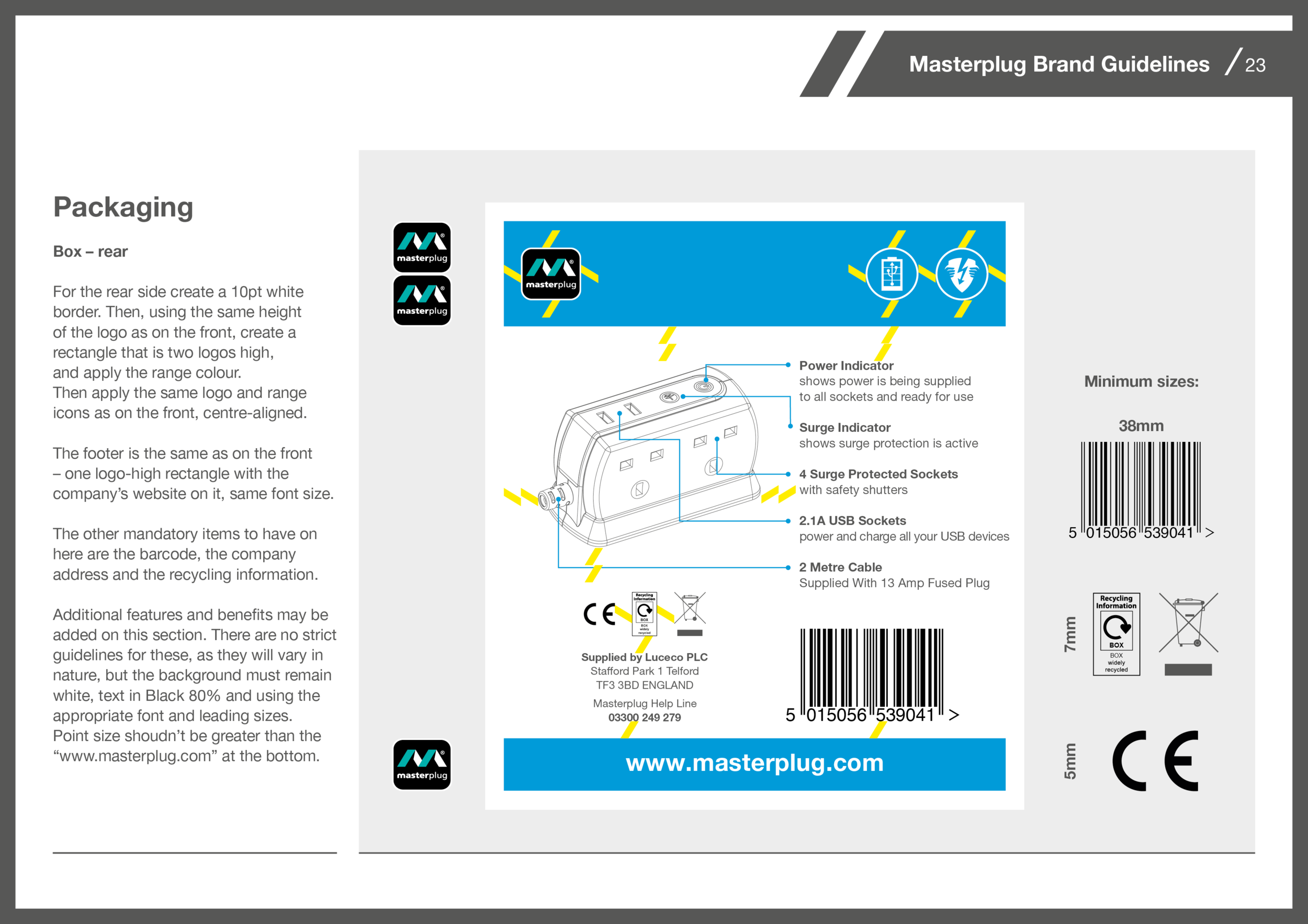
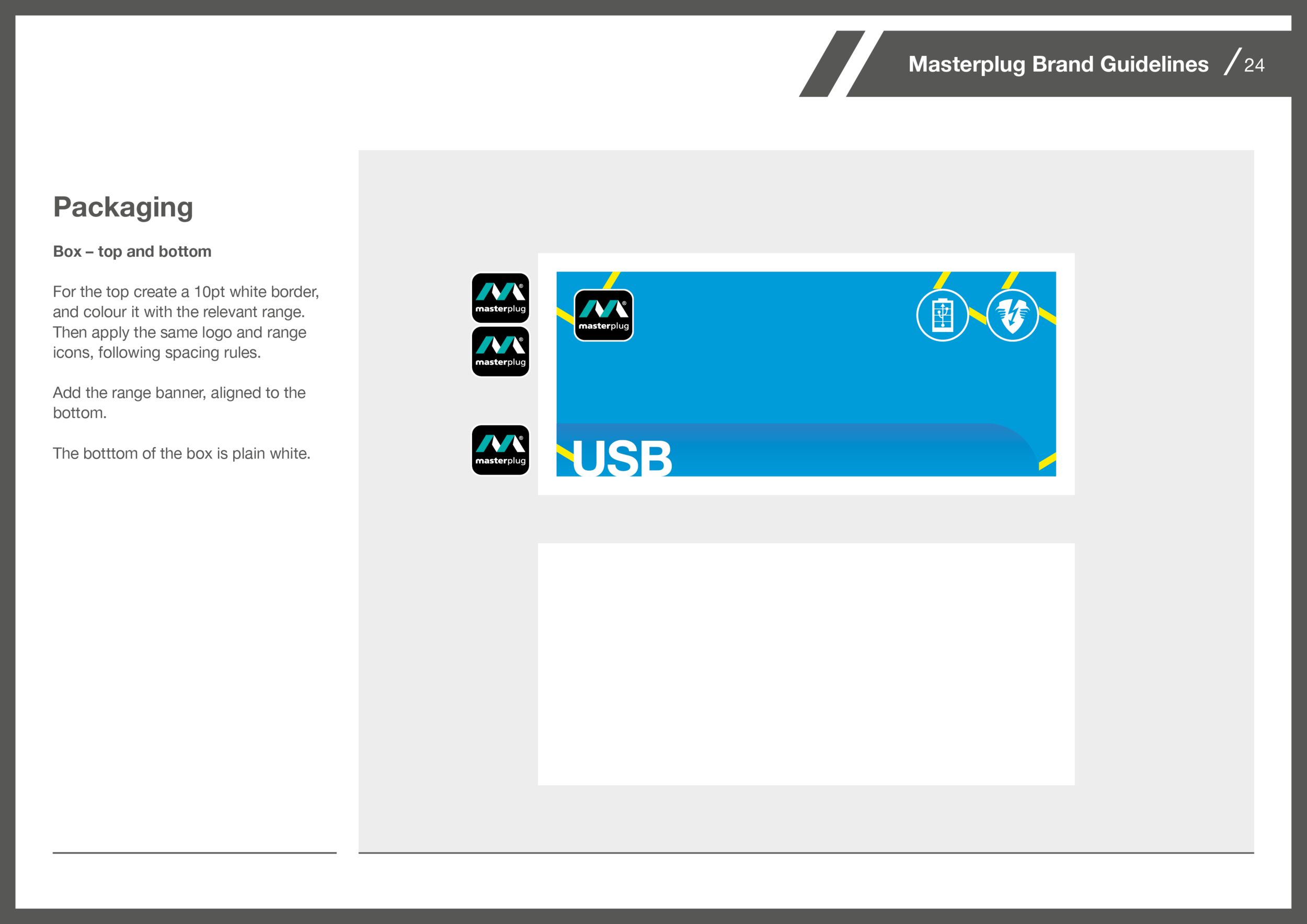
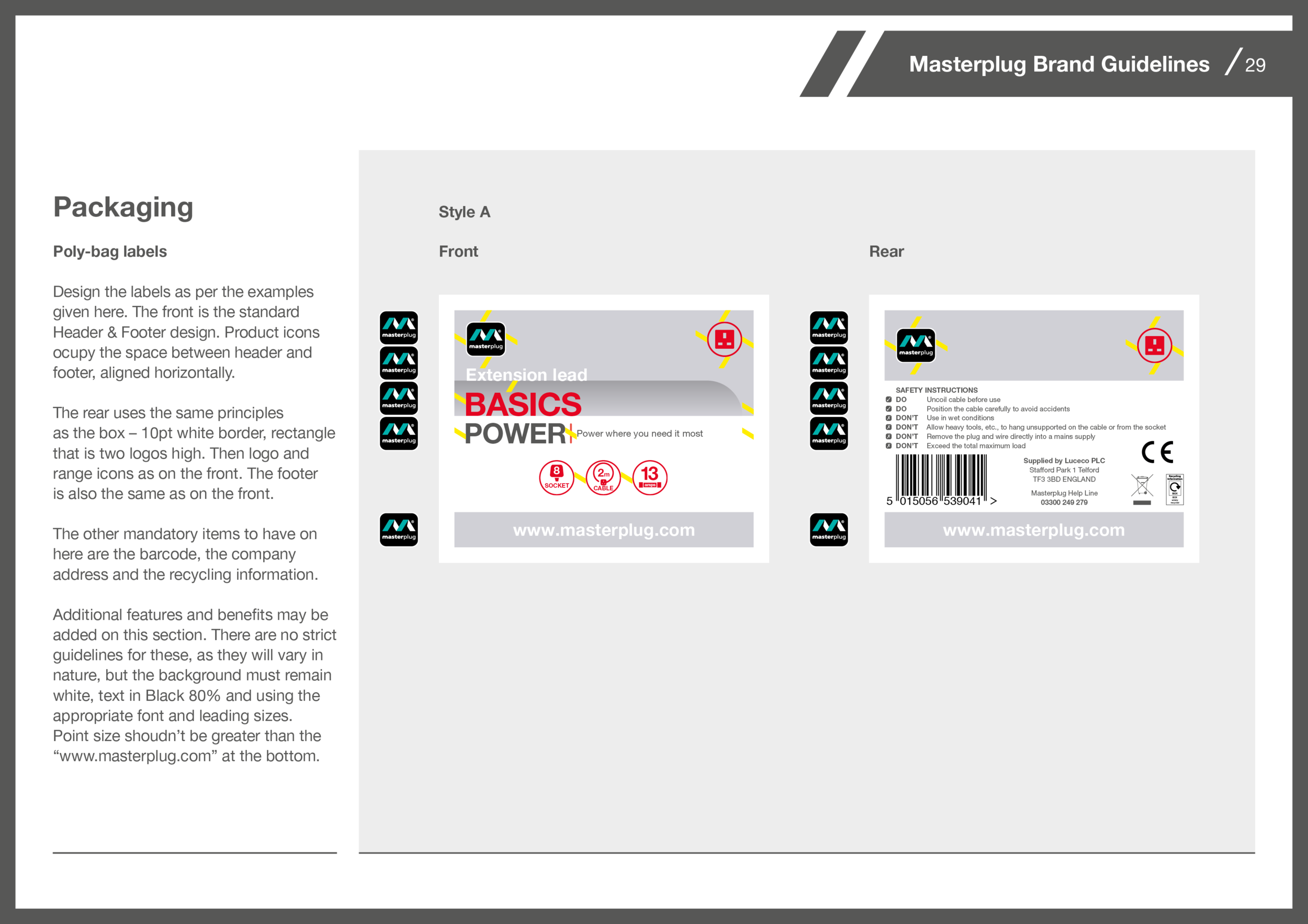
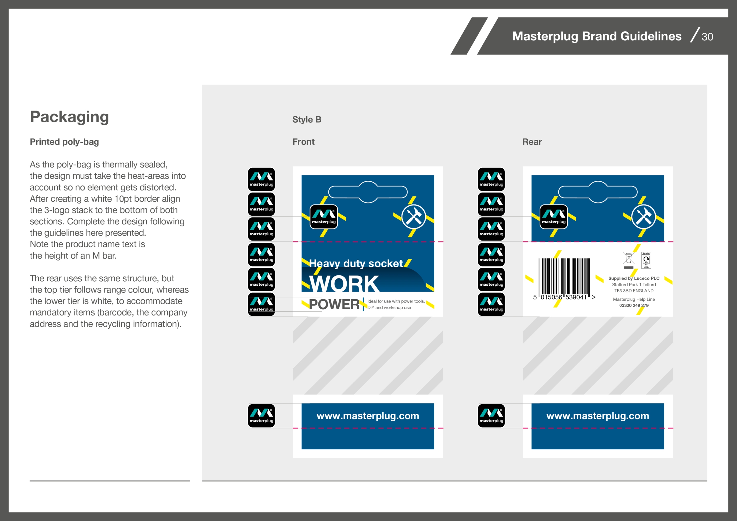
The most challenging section on creating guidelines was the packaging. Masterplug has a vast catalogue of products, with different packaging approaches. And although concepts are developed in London, the design is then implemented by the artwork team in China. The two key points for these guidelines were that they had to be able to adapt to every type of layout and they had to be simple and straightforward to use.